designing information software
I have been thinking about the principles of Bret Victor's essay, Magic Ink, and how it informs software development, especially web development. The basic principles I've taken away are:
- Interaction (esp page switching) should be minimized.
- The data should look good so that it is easy to scan with the eyes.
- Layout should take advantage of all available space to achieve these aims.
I've had the idea to give this website a bit of a makeover for a while (beyond when I switched the header from the oscillating waveform to the static image of the nilFM black hole server logo), so I decided to use this as a case study for these design principles.
reducing navigation
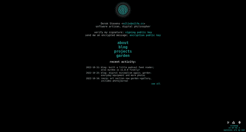
The first thing I wanted to do was overhaul the nav and header to something closer to when I first relaunched the site with eureka (those readers who have been with me a while may remember). Instead of a flat navigation with few links, I wanted to do nested navigation which, while requiring clicks to move through (assuming your browser renders details/summary elements properly), let you see the overall structure of the website and available information without changing pages.
Before:
After:
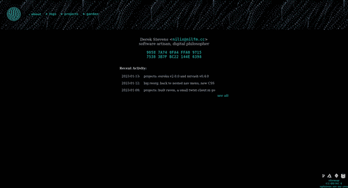
The header expands vertically to give as much space as needed by the "dropdowns", but I really didn't like the way it looked when it wrapped after exceeding the screen width, so I took a hint from Bradley Taunt's sausage link menu suggestion and had it just scroll horizontally which I think works really well. Even on mobile, chances are you see either the scrollbar rendered by Android browsers or the nav options cut off horizontally so you know to scroll to see the rest of it even when you haven't expanded any details.

making the text look good
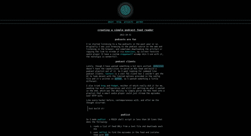
I'm a sucker for monospaced fonts, but even with some spacing applied, the font setup was leaving something to be desired. Especially on Android and Windows, where the default monospace font is not as nice, it really didn't suit me. So I decided to increase the font size a couple points and switch to a serifed font.
Before:
After:
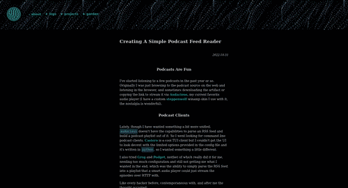
I also played with the alignment of headings, timestamps, the footer etc, to give it a bit more dynamism than before, where everything was horizontally centered.
I still use monospaced fonts in a couple places, notably the links to my email adddress and public key, and in pre and code tags.
using the available space
This was probably the most challenging part of the redesign. There are differing opinions on using a static width for the main text content of your website. Exotic Silicon makes a good argument for increasing font size with page width and using all of it within reason. But I find that the eye tires of having to move so far left and right when jumping from the end of one line to the beginning of the next, so I still prefer a narrower text area.
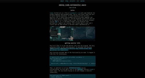
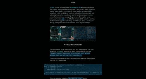
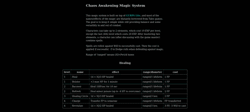
Still, there are a couple areas where we want to use more of the horizontal space. The two examples on this site are pre tags and tables. Because of their nature in showing text (usually multiline portions of code) as-is and tabular data respectively, we don't want to constrain them horizontally if we can help it. So my solution was to have them break out of the restrictions imposed on the other child elements of main (by making those restrictions actually self-imposed on main * and not with a width restriction on main itself), and for these elements I give them their own width rules (fit-content with a max of 100vw), and a rather complicated set of margin-left and transform:translateX() rules for alignment:
main table, main pre
{
  width: fit-content;
  max-width: 100vw;
  margin-left: max(10vw, max(0px, calc(50vw - 250px)));
  transform: translateX(
    max(
      min(0px, calc(min(40vw, 250px) - 50%)),
      min(-10vw, calc(250px - 50%))
    )
  );
}
These rules basically say this:
- If the target's width doesn't exceed the main content area's width (500px or 80vw, whichever is narrower), it should be left-aligned to that content area (like the table at the routine page).
- If the target's width exceeds that width, it should be centered horizontally.
- If the target's width exceeds the width of the page (eg, on mobile; this will only happen with
tablessince thepretags haveoverflow-x: auto), it should be aligned to the left edge of the page and then you can scroll right to see any that overflows.
This allows me to keep most of the content constrained in this center column of the page, but allow these special cases to break out and take advantage of the available space.
Before:
After:
most software is information software
This redesign to nilFM shows how proper layout and typography can make all the difference in UX, and really most software should be 99% about viewing (or listening to) text and infographical layouts, so I think these principles are widely applicable as Bret Victor suggested. I look forward to applying these principles wholeheartedly to upcoming projects and crafting more beautiful and intuitive information software!
